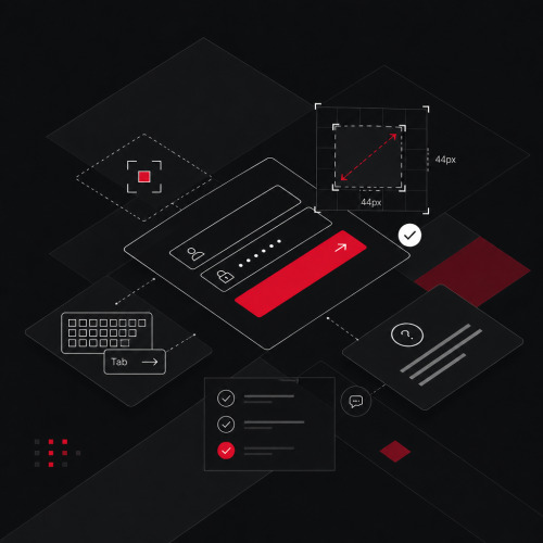
WCAG 2.2 changes how you design web projects. Nine new success criteria directly affect focus indicators, click targets, and login flows. These are core areas of every modern interface design. Anyone who checks these requirements only during code review turns web accessibility into expensive rework. Teams that understand accessibility as a quality feature integrate the new criteria early in the design process and produce more robust interfaces.
What has changed for design projects with WCAG 2.2?
WCAG 2.2 builds on existing guidelines. The new criteria primarily address mobile usage, cognitive accessibility, and keyboard accessibility. For design teams, this means a clear shift. More requirements now lie within the design team's responsibility, not solely in development.
Which new criteria directly affect the UI?
Mentally divide the nine new success criteria into two groups. Code solves the first, design must solve the second. Design-relevant are Focus Not Obscured (2.4.11), Focus Appearance (2.4.13), and Target Size Minimum (2.5.8). In addition, there are Consistent Help (3.2.6), Redundant Entry (3.3.7), and Accessible Authentication (3.3.8). Dragging Movements (2.5.7) lies at the interface of both disciplines because you must offer an accessible alternative for every drag interaction.
What is removed, what remains?
WCAG 2.2 removes criterion 4.1.1 Parsing. It had little relevance in practice. Modern browsers handle faulty HTML structures robustly. All other criteria from WCAG 2.1 remain. You are therefore expanding your existing process without fundamentally replacing it.
How do you solve focus visibility in design?
Focus indicators are an afterthought in many design systems. WCAG 2.2 makes them an explicit requirement. Focus Not Obscured (2.4.11) requires that a focused element is not completely covered by other content. Focus Appearance (2.4.13) goes further and defines minimum requirements for the size and contrast of the focus outline.
Why are focus indicators not a matter of aesthetics?
Keyboard users, screen reader users, and people with motor impairments navigate interfaces via focus. If it is invisible or obscured, they lose orientation on the page. Sticky headers, modal overlays, and fixed-position elements are the most common causes of obscured focus states.
What does an accessible focus indicator look like concretely?
WCAG 2.4.13 defines concrete minimum dimensions. The focus outline must create a border at least 2 CSS pixels wide. The standard also requires a contrast of at least 3:1 between focused and unfocused states. Define focus styles as part of your UX/UI design system as explicit design tokens, not as browser defaults. A focus outline in your brand color with sufficient contrast meets the requirement and appears visually consistent. The W3C documentation on Focus Appearance provides details on the complete specification.
How do you dimension click targets correctly?
Target Size Minimum (2.5.8) applies at level AA. It requires that interactive elements be at least 24 × 24 CSS pixels in size. Alternatively, sufficient spacing to adjacent elements is sufficient. This sounds like a small requirement but surprisingly affects many common interface patterns.
Where do interfaces most frequently fall short of the minimum size?
Icon-only buttons in toolbars, closable tags in filter lists, small checkbox labels, and inline text links with tight line spacing regularly fail 2.5.8. Pagination links and social icons in footers are also typical problem areas. The problem rarely lies with the visible element itself, but with the fact that its hit area is too small.
How do you implement Target Size in practice?
Don't enlarge the visible element, but its hit area via padding or transparent pseudo-elements. This keeps the visual design intact and you meet the requirement. Anyone who consistently implements accessible web design anchors this rule as an integral part of every interactive element. A component system that considers Web Accessibility from the start saves costly corrections.
How do you design authentication without cognitive barriers?
Accessible Authentication (3.3.8) prohibits authentication mechanisms that require a cognitive function test. This includes, for example, distorted text or an image puzzle. The criterion applies at level AA and affects every login flow that requires more than entering credentials.
Why do cognitive tests in login forms fail?
Text CAPTCHAs and image puzzles are unsolvable for many people with cognitive impairments, learning difficulties, or limited vision. While they protect against automated access, they simultaneously exclude real users. WCAG 2.2 does not require abandoning authentication, but the cognitive barrier.
What alternatives to CAPTCHA exist?
Magic links via email, device-side authentication via WebAuthn, and biometric methods meet WCAG 3.3.8 and reliably protect against bots. Ensure that input fields do not suppress autocomplete attributes. Users must be able to freely use their password manager. Copy-paste blocks in password fields are therefore no longer permissible.
Consistent help and redundant entries
Consistent Help (3.2.6) requires that help mechanisms that appear on multiple pages always be in the same relative position. Redundant Entry (3.3.7) requires that users not re-enter information they have already provided, unless there is a clear necessity for it.
What is behind consistent help?
Consistent help does not mean that every page needs a help element. If you offer help, such as a chat, telephone number, or FAQ link, it always appears in the same place. Users with cognitive impairments rely on finding help where they last saw it. This is a layout decision, not a development task.
How do you avoid Redundant Entry in design?
If a multi-step form requires information from an earlier step, you have three options. Display the information before the field, transfer it automatically, or let users confirm the entry. This creates unnecessary effort especially in checkout processes, onboarding flows, and application forms. Anyone who builds this principle into their components from the start saves costly rework during accessibility testing.
Conclusion
WCAG 2.2 places more demands on design than any previous version. Focus indicators, click targets, login flows, and help elements are not marginal topics, but core questions of modern interface design. Anyone who considers these criteria early in the process produces better interfaces and avoids costly rework.
Do you want to know how to concretely implement WCAG 2.2 in your next project? Contact us. We analyze your current status and show you where and how to start most effectively. Schedule your free initial consultation now.