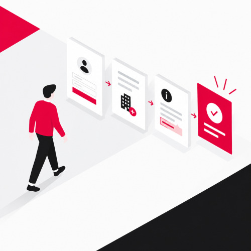

Every product makes a promise. Users only believe it when they experience it. Onboarding in UX design guides new users from registration to the aha moment. That is the moment when they recognize the core value of a product. This article shows you how to design this journey. A well-thought-out UX/UI design helps with this.
What is onboarding in UX design?
When someone enters a new apartment, they first look for the light switch or the toilet. Nobody reads a manual beforehand for this. Digital products work the same way. Onboarding in UX design is the planned path on which new users take their first steps.
This user onboarding includes registration, first steps, hints, and feedback. It ends when users experience the core value.
What belongs to user onboarding?
Imagine an invoicing program for freelancers. The four building blocks can be demonstrated well with this.
- Registration brings users into the program with email and password.
- The first steps guide them to company data and the first customer.
- Hints explain at the right place what a field means.
- Feedback confirms that the invoice has been saved and sent.
How do onboarding and product launch differ?
A product launch introduces a product, for example at market launch. For the invoicing program, this is the announcement and advertising. Onboarding begins afterwards and applies to each individual user. It guides them to their first sent invoice. The launch creates the expectation that onboarding fulfills.
What is the aha moment and why does it matter?
Nobody believes a menu before they have tasted the first bite. The aha moment is the same. It is the moment when users recognize the core value of your product. Your onboarding guides them there by the shortest path.
How do you identify the aha moment of your product?
Ask yourself which action makes the benefit tangible. For the invoicing program, this is the first sent invoice. Adjusting account settings is not part of it.
Interviews show what users experience as their first success. Analytics show which steps they actually take. Both approaches complement each other, as user research methods show.
Why do users drop off before the aha moment?
According to Bitkom, the user leaves or uninstalls the program if they have to search for minutes or experience a confusing menu structure. A freelancer wants to write an invoice today. If the program first requires many company details, they look for another one. Every unnecessary step before the aha moment therefore increases the risk of abandonment.
How do you design registration without barriers?
Only the essentials belong in registration. For the invoicing program, email and password are enough for the first step. You only ask for company name, tax number, and logo when users write their first invoice.
How many fields does registration need?
There is no fixed number. Hick's Law explains the background. The more options users have, the longer they need to make a decision. Forms with too many fields therefore lead to abandonment, as the UX design rules show.
Check your form with these questions.
- Do we need this field for the first success?
- Can we request this information later?
- Is it clear what we use this information for?
How do you achieve login without cognitive barriers?
A user wants to paste her long password from the password manager. If your form blocks pasting, she already fails at login. According to WCAG 2.2, no step of authentication may require a cognitive function test, unless an alternative or help exists. Remembering a password also counts according to W3C. A password remains permitted if users are allowed to use aids like a password manager.
Alternatives are magic links via email or biometric methods, as the implementation of WCAG 2.2 shows. Also avoid duplicate entries. WCAG 3.3.7 requires pre-filling or offering already entered information for selection.
How do you guide users to their first success?
After registration, the user needs a clear next action. For the invoicing program, it reads "Create first invoice". Everything else can wait.
How do you use checklists and progress indicators?
A checklist divides the path into small tasks. This is how it could look in the invoicing program.
- Complete your company details.
- Create your first customer.
- Create and send your first invoice.
A progress indicator shows how far the user has already come. Small successes like growing progress bars can strengthen user engagement. Microinteractions provide feedback for each step.
When do hints directly on the interface help?
The Apple Human Interface Guidelines recommend displaying instructions close to the area of the interface they refer to. In the invoicing program, you therefore explain the field "Payment term" directly at the field. A tour through all menus beforehand requires a lot of memorization. Explain a function only when the user needs it.
How do you celebrate milestones appropriately?
Duolingo deliberately takes playful feedback to the extreme. That fits the brand, but not every product. An invoicing program celebrates the first sent invoice discreetly, for example with a checkmark and a short sentence. Celebrate only real milestones. Confetti for every single action is more distracting.
Which UX onboarding patterns help with this?
UX onboarding patterns are proven building blocks for the start. They differ in effort and use case. Choose the pattern for the core value of your product. The table shows them using the example of the invoicing program.
| Pattern | Example in the invoicing program | What to watch out for |
|---|---|---|
| Welcome screen | A sentence that promises the first invoice | It should remain short |
| Checklist | Three tasks until the first invoice | Too many tasks overwhelm |
| Contextual hints | Explanation directly at the "Payment term" field | Too many hints disturb |
| Guided tour | Tour through the most important menus | Users should have to remember little |
| Empty state | Empty customer list with button "Create first customer" | It needs a clear next step |
Which patterns fit SaaS products?
If a SaaS product has many functions, a gradual entry helps. In the invoicing program, contextual hints and a checklist are better than a long tour. Users learn a function when they need it. Learn more about the technical side in SaaS development.
What matters for onboarding in mobile apps?
Imagine a fitness app. The best entry shows the first exercise there instead of a series of slides. Apple recommends a short, pleasant onboarding that does not require much memorization. If an onboarding is quick and entertaining, users complete it more often according to Apple. Anyone who has an app developed therefore plans the onboarding from the start.
How do you measure whether onboarding works?
For the invoicing program, the first sent invoice marks the aha moment. You should define this action before you measure. Then you see how many users reach it and how long it takes.
Which metrics show success?
Three metrics are enough to start. The first shows how many users send their first invoice. The second shows how long they need for it. The third shows at which step users abandon. Standardized questionnaires like the System Usability Scale additionally provide comparable values.
How do you test variants cleanly?
You suspect that a checklist reduces abandonment? Then test two variants against each other. An A/B test compares both under equal conditions. For this you need sufficient traffic so that the results are reliable. With few users, qualitative tests help better, because with think-aloud you recognize confusion and hesitation directly.
Conclusion
A product is a promise, and users only believe it when they experience it. Good onboarding in UX design creates this moment early. To do this, define the core value, keep registration lean, and guide users to first success with a clear next action. Measure the path before you add more patterns.
Do you want to review or redesign your onboarding? Schedule a free initial consultation with us.
Sources & further reading
- Apple Inc. (n.d.): Human Interface Guidelines, Onboarding. Available online at: https://developer.apple.com/design/human-interface-guidelines/onboarding
- W3C (n.d.): Understanding SC 3.3.8, Accessible Authentication (Minimum). Available online at: https://www.w3.org/WAI/WCAG22/Understanding/accessible-authentication.html
- W3C (n.d.): Understanding SC 3.3.7, Redundant Entry. Available online at: https://www.w3.org/WAI/WCAG22/Understanding/redundant-entry.html
- Bitkom e. V. (2017): Damit der Anwender nicht zehnmal klicken muss, Press release. Available online at: https://www.bitkom.org/Presse/Presseinformation/Damit-der-Anwender-nicht-zehnmal-klicken-muss.html